So, we all know how hard it is to capture someone’s attention, especially online or in a magazine that people are just flipping through, right?
But what DOES make you stop and notice something? Often it’s a chart or diagram that helps you understand a concept or trend at a glance. We love visuals, we love to be smart, and we love things that make it easy for us.
So, how can you turn your complex product, concept, or ideas into visuals that make people stop what they’re doing and pay attention to YOU?
![]()
![]()
![]()
Transcript – Get Attention and Sell More by using Charts and Diagrams
Paula Williams: Welcome to aviation marketing Hangar Flying Episode 31, How Charts and Diagrams Can Help Your Marketing.
Paula Williams: I’m Paula Williams.
John Williams: And I’m John Williams, and together we are ABCI.
Paula Williams: And ABCI’s mission is
John Williams: To help you guys out there and girls help you sell more stuff in the aviation industry.
Paula Williams: Exactly. So use the hashtag #AvGeekMarketing, A-V Geek Marketing, and we promise we will reply to every tweet. We love to have you as part of the conversation. We love to hear what you think about this episode, and about anything else really, about our articles, webinars, and so on.
So we’d love to have you be part of the conversation. Let us know what you agree with, what you, heaven forbid, disagree with, or anything else. All right, so our motto is, No Random Acts of Marketing, right?
John Williams: Of course.
Paula Williams: Okay, you want to know what you’re doing and why.
John Williams: And integrate all of it preferably.
Paula Williams: Exactly. And so why we want to use charts and graphs in our marketing. This is something that is not done enough, I think, in aviation. And it’s something that is a huge opportunity for anybody who is willing and able to take a little bit of time to add this to their marketing mix, right, and all of their materials that they produce.
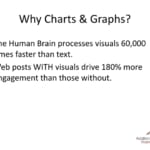
And the reason why is because, of course, the human brain processes visuals 60,000 times faster than text. When you read text you have to, of course, read it, which involves some thought. And then you also have to put it together and synthesize it with other things that you’ve read and judge it and other kind of things.
Visuals seem to bypass that whole process. They’re used by a different part of the brain. And it just lights up and people just get it without having to actually do any processing. And what that does is it becomes more credible. People are more likely to believe something they’ve seen rather than something that they’ve read.
And then the other thing is that you can actually convey more information in less time. And given the fact that it is so hard to get people’s attention nowadays, you really want to use that attention in the most efficient possible way, right?
John Williams: Absolutely.
Paula Williams: Okay, and the other thing is once you get their attention, you are a lot more likely to keep it if you’re using visuals than if you’re not.
Web posts with visuals drive 180% more engagement than those without. And when we say engagement, we mean scrolling, we mean clicking, we mean sharing, we mean responding, all of those things that we want people to do, rather than just kind of passively absorbing our content.
John Williams: Hence video and Google’s emphasis on it.
Paula Williams: Hence video and Google’s emphasis on it. And hence all of the social media feeds, you’ll notice things have been getting a lot more visual. They’re allowing larger images on Facebook than they did a while ago. They’re allowing larger images on Twitter than they did a while ago.
And of course, Instagram and Pinterest are nothing but visuals, really, with a de-emphasis on text.
John Williams: And if you recall the glass panels of the past, they were smaller visual displays than they are these days.
Paula Williams: Exactly. As technology has improved over time, people in aviation, as well as every other industry, are seeing a lot more charts and graphs.
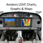
And if you look at a glass instrument panel, what you’re really looking at is charts, graphs, and maps, right?
John Williams: [LAUGH] Right, visually.
Paula Williams: Mm-hm. Yeah, you’ve got a thing, I think, on the G1000 where you can look at the exhaust gas temperature for each cylinder. There’s a cute little chart, and that is a thousand times easier to process the information quickly than if you’re looking at [CROSSTALK] just numbers.
John Williams: Sure, because if you have a graph, you can tell which, if any of them are far enough out that you need to be concerned with them.
Paula Williams: Exactly, and the data that a pilot has to process, there’s a whole bunch of numbers going through your head when you’re flying.
But you’ll notice when anything turned red, it gets your attention. And whenever it turns green, you go, okay, everything’s all right. So everything is kind of coded, and pilots are really trained to respond to visual stimuli. And we can take advantage of that, as marketing people, and use that to our evil intentions, right?
John Williams: [LAUGH] Or not so evil intentions.
Paula Williams: Exactly. Okay, so any time you’re conveying a lot of data or you want to make a point, what you really want to do is kinda step back and think about, is there a way that I can make this visual? Now this is one of my very favorite charts.
John Williams: Great.
Paula Williams: Can you tell why, John?
John Williams: [LAUGH] Yeah, it’s because your company is on top.
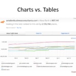
Paula Williams: Because our company’s on the top of it, exactly. This is a company called alexa.com and they rank every website on the Internet. And if we stack our website, abci.flywheelstaging.com, against a lot of the other aviation marketing companies in the world and we look at how much traffic they get as measured by Alexa.
ABCI’s or abci.flywheelstaging.com’s website is that red line across the top and it’s a nice upward arc, which is a lovely shape. If you’re in marketing, or if you’re in business of any kind, you want to see those upswinging charts, right?
John Williams: Yes, and there are other means of measuring traffic besides Alexa, and we use all of them because you don’t want to trust any one source.
And we’re high up in all of them as well.
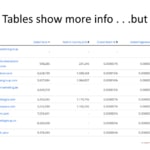
Paula Williams: Exactly. So even though I may not completely believe every piece of information that I see in a chart or a table, right here what I’m going to show you in a minute, this same data presented in a table form and it just doesn’t have the same-
John Williams: Impact.
Paula Williams: Yeah, je ne sais quoi as seeing that beautiful red line across the top here. So if I look at this in a table, okay, that’s great information. And actually the interesting thing about it, is it shows me even more information than the chart does.
John Williams: Tabular-wise.
Paula Williams: Yeah, tabular-wise. So this is a table with a whole bunch of numbers on it, and it could be argued that this should be more compelling and this should be more interesting to me than the chart. But it’s not, and the reason is because people’s brains process the charts faster.
And also visual information is more credible, rational or not, than tabular data.
John Williams: Yeah, this is on a second page because the people look at the chart and they want to drill down, then you go down and you can go and look for specifics.
Paula Williams: Exactly, and that’s a fantastic way of presenting data.
If you really do need to show the details, that’s great, but show a summary in a visual way and then let people drill down if they want to and see the actual numbers.
John Williams: Of course.
Paula Williams: Okay, and the other thing is, you really want to simplify and only convey one piece of information with each visual, because one is the most powerful number in marketing, right?
John Williams: Right.
Paula Williams: Yep, all right.
John Williams: As long as you’re the number one [LAUGH].
Paula Williams: Okay, even if you’re not.
John Williams: Had to throw that in.
Paula Williams: Yeah, exactly. That would convince me to do something about it though.
John Williams: If you weren’t.
Paula Williams: If it were data that I didn’t like, it would be more compelling on for me to take action on, right?
John Williams: Sure, and it did happen once, six or eight months ago.
Paula Williams: Yeah, exactly, and we looked at that chart and went, my goodness! And it compelled immediate action on our part. And we actually spent some money and did some stuff and made things happen to change things.
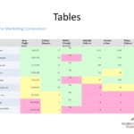
Okay, so if you have to convey information in a table, you can still make it more interesting using color, right?
John Williams: Mm-hm.
Paula Williams: Okay, so what you can do is, and I always recommend using the concept of a heat map where green is good.[LAUGH]
Paula Williams: And colors in the red family are bad, because every pilot on the planet, and actually most human beings in general, have been kind of trained into that color scheme that green is good, red is bad, yellow is in the middle.
So if you take any set of data that you need to present to someone and you put it into a table, you can show the best things, or the items that are performing the most optimally, are in green. The things that are in the middle are yellow. And the things that could stand some improvement are red, right?
John Williams: Of course.
Paula Williams: Okay, so you can absorb a lot more information a lot more quickly in a color-coded chart than you could if it were just numbers, rIght?
John Williams: Yes.
Paula Williams: Okay, so charts versus tables, charts win, right?
John Williams: Mm-hm.
Paula Williams: Tables, though, you can still improve.
John Williams: Sure.
Paula Williams: By using color. Okay, so let’s talk about diagrams. Everybody in aviation, especially if they’re in aviation maintenance of any kind, loves diagrams. If you didn’t love diagrams you would not have made this your career, right?
John Williams: Yeah, because there’s all these troubleshooting charts that if this, if that, does this work?
No, yes, go left, right.
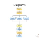
Paula Williams: Mm-hm, absolutely, so even if you have something that is a concept, like this is our workflow for producing podcasts. When we do this for clients, when we do this ourselves. We have monthly strategy sessions, we record the interviews and episodes, then we have three things that happen at the same time.
Somebody does mixing, editing, and production. Somebody does show notes and transcriptions. And somebody does graphics and art. All of that comes together. We have an approval step. We do the hosting, publishing, and distribution, and then we do the promotion, and then we do the analytics and reporting. Now, I can tell you all of that.
John Williams: [LAUGH] Like you just did.
Paula Williams: Like I just did. And it takes forever to explain it to somebody. But if I just show them a diagram, they get it much more quickly. Because you can show them the workflow step by step, and then you can show them, here’s a split in the road where three things happen at the same time.
Then you show a converging path where it all comes back together. It’s so much easier to show than tell. But since this is a podcast, I’m explaining this all.
John Williams: [LAUGH] Of course.
Paula Williams: Right, but diagrams are a wonderful thing, and any time you have a concept or a process, people who purchase aviation products and services, services especially, they love to see what’s going to happen after you take my money.
If you can show them a diagram of this is what’s going to happen after you take my money, they feel a whole lot more comfortable about parting with that money, because they know exactly, step by step, here’s what’s going to happen. So you can take advantage of the credibility that is afforded by those visuals by using a diagram, even if it is an abstract process or a workflow.
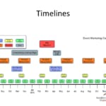
Another thing you can do is timelines. This is an event marketing campaign that we put together for a customer. And you can see it’s got informational emails, promotional emails, post cards, thank yous, thank you post cards, printed newsletters, a landing page, a phone call, and all of these things take place over time.
And if we stretch this out on a timeline with cute little boxes, it’s 1,000 times easier to understand than if we were to outline this all in text. Or if we were to explain it to someone on the phone, there’s no way they could remember all of this information.
Whereas if we just hand them a one-page timeline, it really helps them understand and also helps build that credibility of, here’s exactly what you’re getting for your money.
John Williams: Precisely.
Paula Williams: Yeah, cool, so diagrams. If you sell a component or a service having to do with aircraft, if you can show exactly what part of the aircraft you’re going to be dealing with, all of the textbooks having to do with aviation that I have ever seen.
And that’s for flying airplanes, for maintaining airplanes, for anything else, they are full of cut-away diagrams, of exploded diagrams, of other ways of showing an airplane and how this fits into the airplane. So we always recommend, even if it’s a fairly simple thing, if you can explain it in a visual way.
One thing that we’ve noticed about customers, especially in the aviation industry, is they will never, ever, ever tell you that they don’t understand what you’re saying, right?
John Williams: Well, they’ve been trained not to.
Paula Williams: Really, why is that?
John Williams: Well, if you’re going to be a pilot, you’re never lost.
You may get disoriented.
Paula Williams: But you’re never lost.
John Williams: But you’re never lost [LAUGH].
Paula Williams: Exactly, so if I’m trying to sell you something and you don’t understand what I’m saying, what are you going to tell me?
John Williams: I don’t. I need to have this all over again, hit me again.
Paula Williams: Exactly, you’ll tell me many, many things, or you’ll just plain not buy.
John Williams: Right, this is a lot of the things happen, if you get lost, too far lost.
Paula Williams: Yeah, so you’ll go away from the situation, or find a way to excuse yourself from the situation.
Say you don’t have the money, you don’t have the time to implement this. You’d come up with some excuse other than that you don’t understand.
John Williams: Yes.
Paula Williams: Not that you’re a dishonest person or anything.
John Williams: No, it’s baked into people.
Paula Williams: Exactly. So whatever objection you’re getting from your customers, consider the possibility that maybe the real objection is that they just don’t understand your product.
And go back through your marketing materials and see if there’s anything that you can simplify or anything that you can explain visually in a more simplified way that will help them understand. And I would bet dollars to donuts that every step you take to simplify your marketing materials, they will actually work better.
John Williams: It doesn’t really matter what the product is, from deicing machines to log management software. It’s all the same. People don’t completely, if they don’t get a good idea of the overall how it works and what it’s going to do for them, they won’t go for them. They may go with a competitor if they explain it better.
Paula Williams: Exactly, and this comes back to whatever they’re doing now is apparently working well enough for them to be doing business and so forth and so on. So if you want somebody to change their behavior, they have to absolutely understand what your product is, and understand the compelling reason why it’s better than what they’re doing now.
And the easiest way to make them understand is to use visuals, really.
John Williams: Or videos or both.
Paula Williams: Or videos or both. Yeah, videos are even better for the same reasons. Because you can actually show somebody, this is how you install this component or this is how this works.
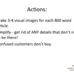
Or have somebody explain in a way that helps build credibility with that person, that they really understand what they’re talking about, and have them explain a concept in way that people understand. Okay, so actions from this episode. First, you really want to make three or four visual images for every 800-word article.
So if you are putting together a page for your user manual or if you’re putting together a post for your blog or anything else, any time you’ve written over 800 words, for any purpose whatsoever that has to do with customers, think through, or get somebody to think through or commission a graphic artist or somebody, to make three or four visual images.
John Williams: So what you’re saying is that an image isn’t worth 1,000 words, it’s worth 200. The old saying was a picture’s worth 1,000 words, and what you’re saying here is a picture’s worth 200.
Paula Williams: You can’t do the math exactly-[LAUGH]
Paula Williams: I hadn’t thought about it that way, but I guess that’s true.
But your 800-word article is going to be 1,000 times, going to be 8,000 times, well, 3,000 or 4,000 times more effective because-
John Williams: I’m just giving you crap, I know.
Paula Williams: Because they put together three or four visual images.
John Williams: But math is my thing, I just couldn’t help myself.
Paula Williams: I know, you saw numbers and you had to make an equation out of it.[LAUGH]
Paula Williams: Aviation people are like that, too.[LAUGH]
Paula Williams: Okay, the other thing you want to do is make sure that you simplify. You want to get rid of any details that don’t need to be there in those visual images.
John Williams: Absolutely.
Paula Williams: So you never want to try to convey more than one set of information with a visual and you always want to get rid of. And this is why commercial photography, especially in aviation, is so expensive, is because it takes so long to set up the perfect shot by eliminating all of the distractions.
John Williams: And getting the light correct, and the right time of the day if it’s an airplane, and so forth and so on.
Paula Williams: Yeah, simplifying things is vastly underrated in the difficulty of making simple images or making simple designs or simple photographs. And I think that’s why Apple has done so well is because they’ve done such a great job of simplifying all of their design.
You look at any photograph from Apple and there are no distractions whatsoever. So they’re a great role model here. And the last thing is just confused customers don’t buy. If you’re ever getting any resistance in your sales process, look at the marketing materials that you’re using at that stage in the process.
And I would be willing to bet that your marketing materials may be too complex. You may be able to simplify them in some way that’s going to make them a whole lot more compelling. And that’s always the easiest way to improve a sales process is to simplify your marketing material.
John Williams: Simplify and be consistent.
Paula Williams: Simplify and be consistent. Speaking of consistency, this week we are consistently offering our Aviation Brand Design Brief Template for free. You just basically go to ABCI1.com/BrandTemplate.
John Williams: And that’s the number 1.
Paula Williams: Yeah, A-B-C-I, alpha, bravo, Charlie, India, number one.com/BrandTemplate. And you can download a template that’s going to really help you be consistent and carry your consistent branding across everything that you do.
Including printed materials, online materials, websites, sales presentations, and everything should have a consistent look and feel because.
John Williams: And remembering the cake that you showed me with [LAUGH] stuff on it. It’s A-B-C-I. What kind of number is? The Arabic number 1.
Paula Williams: The Arabic number 1, not the Roman numeral one, which would be I.
John Williams: And not the Arabic number 1 spelled out but the actual number 1.[LAUGH]
Paula Williams: Exactly.
John Williams: Anyway.
Paula Williams: Yeah, John saw this. I have to tell you, it’s one of those social media things that just makes the rounds. Where, it’s cakefails.com I think is the name of it where people are writing on cakes and it says something like, say this twice and so they say this twice.
[LAUGH]Paula Williams: You know, they take it very, very literally what somebody told them on the phone to do with this cake so, it’s insane. All right, so get out there and sell more stuff, America needs the business.
John Williams: Our good buddy, Zig Ziglar.
Paula Williams: Exactly, that’s our favorite quote to end on.
Subscribe to our podcast, aviation marketing Hangar Flying. We’re on iTunes, Stitcher, and Google Play. And please do leave us a review. And we’ll see you next week.
John Williams: Ciao.
}.










Leave A Comment