Many things have changed since we first published –
- Companies have laid off or lost the personnel that used to make regular updates to their web sites.
- Companies are using prebuilt, fill-in-the-blank “web site builders,” which are increasingly inexpensive and good-looking!
- Some companies, particularly flight schools that cater to a younger audience, are forgoing web sites as “old school” as they focus their marketing resources on TikTok and Instagram
The problem?
Many web sites simply aren’t resonating our performing, because they are out of date, (in the case of lost personnel) superficial (in the case of web site builders that look great but don’t really resonate with your customers) or dependent on the whims, failures and outages of third parties (in the case of Instagram and TikTok.)
What hasn’t changed? The principles of great web site design that supports your sales process.
We’re students and practitioners of aviation website design. We have built dozens of web sites for aviation-related companies in the last two years, and each one we launch gets slightly better results.
Why?
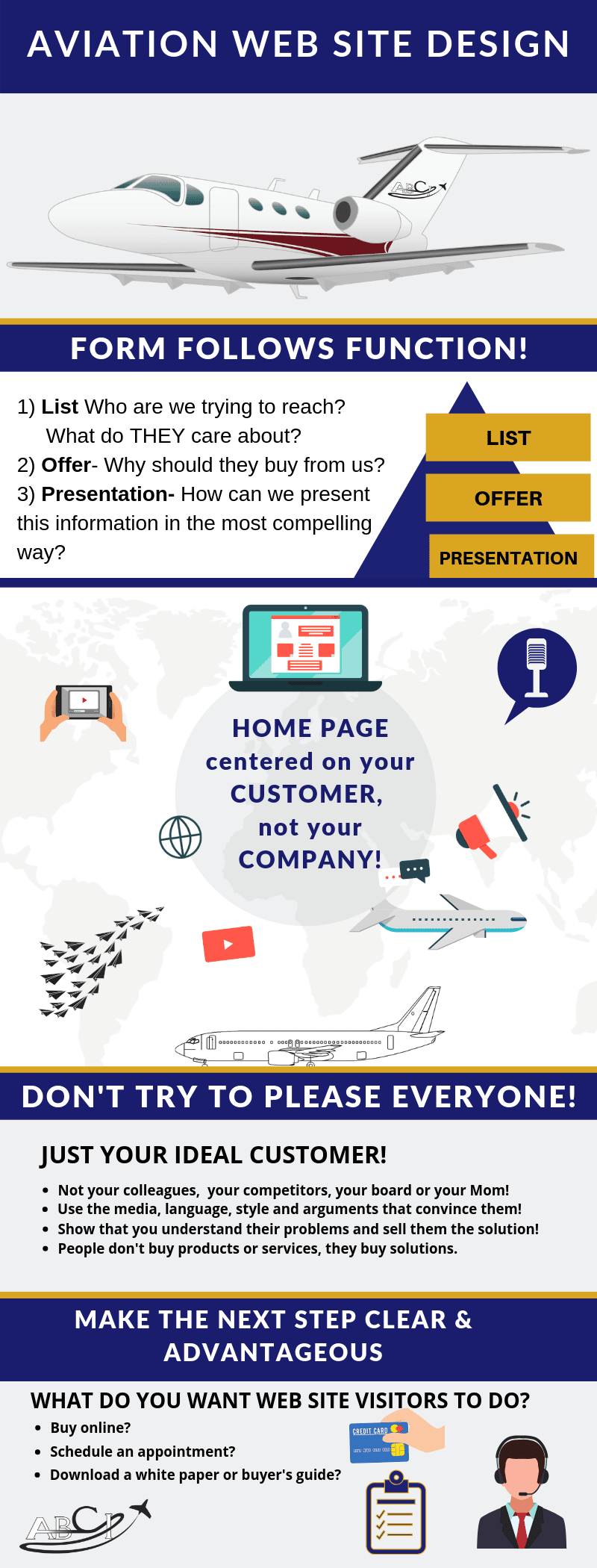
We’ve boiled down our learnings to three key factors:
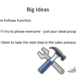
- Form Follows Function
- Don’t Try to Please Everybody, Just your Ideal Prospects
- Make the Next Step Clear & Advantageous
We’ve found that the sites that best follow these key factors do the best. Aviation customers are smarter and more savvy than retail customers. They expect more from every interaction with an aviation-related company, including your web site!
See video and transcript of our discussion here.
Transcript – Aviation Website Design
Paula Williams: Welcome to aviation marketing Hangar Flying episode number 85. This episode is actually devoted exclusively to aviation website design. So I’m Paula Williams.
John Williams: And I’m John Williams, still trying to adjust the recorder here. Okay.
 Paula Williams: You want to go back and start over?
John Williams: It’s okay, they can hear that.
Paula Williams: Okay, cool. [LAUGH] We have new audio equipment, which is fun. And we are ABCI, and ABCI’s mission is?
John Williams: To help all you ladies and gentlemen out there in the aviation world sell more products and services.
Paula Williams: Absolutely. So if you use the hashtag #AvGeekMarketing, AVGeekMarketing, we will find any responses you have, any questions you have, or anything else you to say.
And we try to reply to every one of those and make sure that we respond. So we love to hear what you have to say about this and every episode, or about future episodes you’d like to hear. So let us know. All right, so today’s big ideas. When we’re talking about aviation website design or building a website for an aviation company, right?
There are really three big areas where people can go seriously awry, right?
Three Common Problems in Aviation Website Design
John Williams: [LAUGH] At least three.
Paula Williams: [LAUGH] At least three. Well, we’ve pretty much narrowed it down to three for the purpose of today’s discussion. And I think most of the problems that we see fall into one or more of these categories, would you agree?
John Williams: Yeah.
Paula Williams: Okay. So the three big ideas about aviation website design and your online presence, and the three things that people get wrong, and if you can just follow these three basic principles, then your web design is going to be a whole lot better. And just to give you an idea of our background and why we have come to this conclusion.
We look a lot of bad aviation website designs, right?
John Williams: [LAUGH] That’s not very nice, but at least you didn’t name them.
Paula Williams: [LAUGH] No, I didn’t, and I’m not going to, either.
John Williams: That’s good.
Some Bad Aviation Website Design Examples
Paula Williams: We’ll name some good ones and we’ll show you some bad ones, but we’ve blacked out the identifying information to protect the guilty.
But we do look at a lot of aviation websites. And I think websites are something that a lot of people in aviation don’t want to spend a whole lot of time on. They’d rather be doing something else. And so they tend to just hire somebody to put their website together, somebody that maybe doesn’t know that much about aviation. They don’t want to get caught up in a big discussion about meta descriptions and keywords and crazy jargon like that. As long as there are no broken links and the pages look nice, they’re happy.
Or somebody that doesn’t know that much about your specific business and kind of throws the money over the wall to them and says go build us a website.
John Williams: [LAUGH]
Paula Williams: And we’ll see you on the other side, right?
John Williams: Or slips it under the door.
Paula Williams: Or slips it under the door, exactly.
And so then they build a website, and they do the best they can, given not knowing anything about the company or about the industry or about your customers or anything else. And then things end up being somewhat askew. And the website doesn’t do all it, it’s not being all it can be.
[LAUGH]
John Williams: Well, even if they knew all the stuff you just said, they don’t know what you want it to do.
Your Web Site is An Extension of Your Company
Paula Williams: Exactly. So a website really is an extension of your business into the wild world out there via technology. So that people can find you that would not normally walk in your door.
And to perform that function, it has to reflect your business, and it also has to reflect your priorities. So the whole idea of form follows function is kind of Frank Lloyd Wright concept of architecture. But it’s also true of websites. If it’s not clear what you want out of the website, then it’s not clear what it’s going to do for you.
And you paid a lot of money for something that has no clear purpose. And it just sits there, right?
John Williams: Exactly.
Form Follows Function
Paula Williams: Okay. The next thing is, so that thing number one is form follows function. Thing number two is don’t try to please everyone, just your ideal prospect.
So I think a lot of people try to throw too much into their website and make everybody happy.
John Williams: They have to do the same thing they do with their company. They have a core business process that they identify as what they do.
Paula Williams: Mm-hm.
John Williams: And you need to focus on that rather than, yeah I can do that for you, and yeah, I can do that for you, too.
And then you can get lost in all these little things you can do for people and not get what you really want.
Paula Williams: Exactly. So you’re constructing an aviation website. You want to keep in mind the people that are going to be using that website. And if you try to be everything to everybody, you’re going to do a really bad job of pleasing anybody.
And in this industry in particular, we don’t want to serve everybody, right?
John Williams: No.
Paula Williams: We want to be exclusive to a very specific group of people who are our likely customers, right?
John Williams: Well, if you sell remanufactured, rebuilt propellers, you’re not going to want to have customers if all they have is turbines.
Paula Williams: Exactly.
John Williams: Turbo props, yeah, maybe. But that’s all.
High End Design is for VIP Charter, Not Necessarily for Landing Gear
Paula Williams: Right, so you have a very specific group of customers and if you make your website very high end and look really good to business jet people, then you’re kind of missing the mark there, right?
John Williams: Right, or if you rebuild turbine engines you certainly don’t care about those guys out there with the recips.
Paula Williams: Exactly, and then your site’s going to be a lot more corporate and polished, and fit a completely different audience. Your design firm should understand that, and not always be just working on the slickest, coolest design.
John Williams: Mm-hm.
Paula Williams: So very few people would be shopping for both. So you don’t have to please everybody.
John Williams: Exactly.
Get People to Take the Next Step in the Sales Process
Paula Williams: Okay. The third thing, the third big idea, is that you want to get people to take the next step in your sales process.
So your website should incite some kind of action, or inspire some kind of action-
John Williams: [LAUGH]
Paula Williams: To use maybe a more positive term. [LAUGH] Inciting riots or inspiring people to do business with you, I guess that’s probably a better word, right?
John Williams: Mm-hm.
Paula Williams: Okay, cool. So let’s dive into this and start talking about the first big idea which is form follows function.
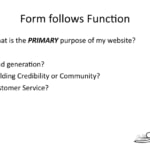
So what you want to think about is what is the primary purpose of my website?
John Williams: Yeah, because if it’s lead generation then it’s sort of like a billboard. You want to put it where the people are going to see it.
Paula Williams: Mm-hm.
John Williams: And put on there what they can say, I need to call those guys.
Paula Williams: Mm-hm.
John Williams: Or I should click on this.
Paula Williams: Right. So a lot of people try to make their website sort of all masters and do all of these things. And you can do that, but you have to figure out what the primary purpose is, and that should be the focus of your homepage.
Your Home Page Should Do Only One Thing – Reassure The Visitor and Get Them To Take the Next Step.
Because any advertising activity or any piece of aviation advertising, whether it’s a webpage or an email or a postcard or a piece of paper or a flyer or digital marketing, an ad in a magazine. But each ad can really only accomplish one goal very successfully. So your website homepage is the same thing. In simple form, it’s like the front door of your business.
What is the first thing you want to communicate to the people that walk in? Are they mostly new customers that you want to do business with? Are they mostly old customers that you want to provide customer service to? What’s your primary objective? What’s the first thing you want them to see or do when they get to your website, right?
John Williams: Absolutely.
Paula Williams: Okay, cool. So if your primary purpose of your website is international aviation marketing and lead generation, meaning you want everybody that comes to your website to be a potential customer and to do business with you, then you’re going to do like what they do in a store. When you walk in to the store, what is the first thing they say to you?
“How Can I Help You?”
John Williams: Hi.
Paula Williams: Okay, what’s the second thing they say to you?
John Williams: [LAUGH] How can I help you?
Paula Williams: How can I help you? What can I do for you, right? You want your website to serve that purpose and you want it to be really obvious how you want that relationship to go.
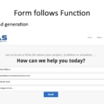
So something along the lines of, how can I help you today? And have a lead generation form saying, here’s the basics of what we do, and then the very next thing they see is here’s how you interact with us.
John Williams: Yeah, because you walk into a store, most of the time unless you’re one of those lookie loo shopper kinda people, you’re looking for something specifically.
Paula Williams: Yeah.
People Don’t Visit B2B Aviation Web Sites to Be Entertained.
John Williams: So it’s natural for them to go, well, you look like you’re looking for something. How can I help you? And then the website works the same way.
Paula Williams: Exactly, people don’t visit aviation websites usually for entertainment. [LAUGH]
John Williams: [LAUGH] You can entertain them later, but not on your home page.
Paula Williams: They’re usually, especially the business to business type of here’s the landing gear or you’re a aircraft broker or you’re an insurance guy or you have an app, or whatever it is that you do.
Chances are when people come to your website it’s because they need something. And those are the kind of people you want to come to your website. And you want to serve them as quickly and efficiently as possible, right.
John Williams: Of course.
You Can’t Ask What They Need, So You’ll Have to Guess.
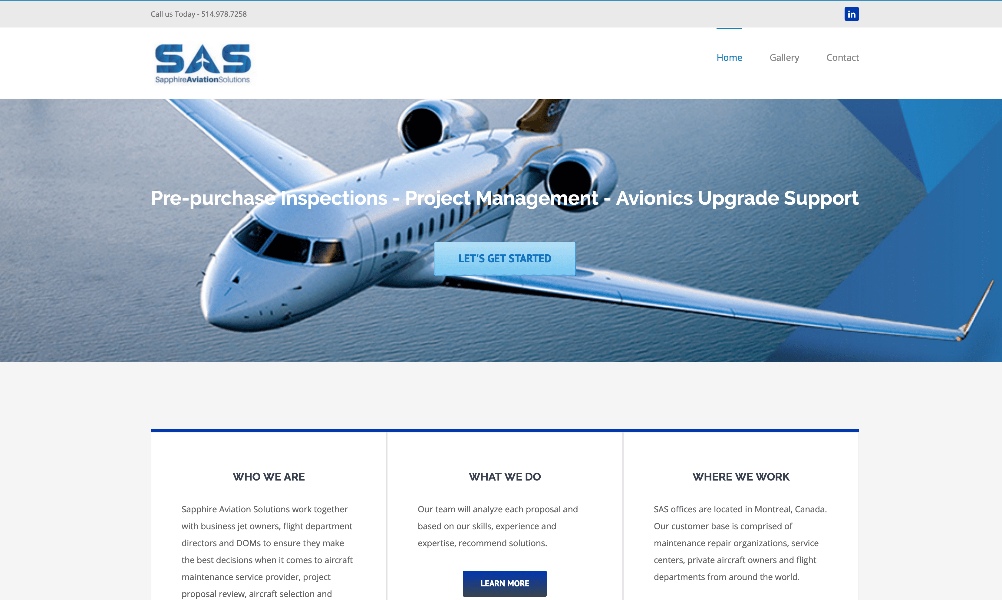
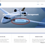
Paula Williams: Okay, cool. This is a website that we just did for Sapphire Aviation Solutions. 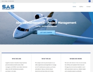
And you can see front and center big blue button, let’s get started. And that goes to that form, how can we help you today? So you really want to make it obvious what people are supposed to do, and also how to get started because they’re there for a reason, and you want to get right to it.
Now, the search engine, or your business card, or your ad has brought this person here because they work looking up a particular keyword or phrase. Or they met you at a trade show. Or your ad intrigued them for some reason.
Usually, they’re visiting your website because they have your business card and they met you at a show, they heard about you from somewhere else. They’ve done a search on the Internet for, in this case it might be project management for aircraft maintenance on turban aircraft. Whatever it is that they were looking for, that’s how they got here, and they want a solution as quickly as possible.
So the better you do what they want, the better they will do what you want which is to hire you to do business with them, right.
John Williams: Of course.
Lead Generation, or Credibility Building?
Paula Williams: Okay, cool. So if your function is lead generation, that’s an obvious solution. If your function is something else, or if your primary objective is something else, for example, credibility or community building.
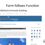
I think the Airplane Geeks podcastwebsite does a really nice job of this. They have their latest episode up. They have ways to engage with them, how to subscribe to them on iTunes or Google Play or Android or RSS, how to reach them on Twitter, or Facebook. So what they’re doing is they’re encouraging interaction by having all of that stuff front and center.
Because they obviously have a different purpose than Sapphire Aviation Solutions, right.
John Williams: Mm-hm.
Paula Williams: Okay, and they serve their customers very quickly and very easily. Most people that come to their website want to know what’s the latest episode and or how do I subscribe, right.
John Williams: Yes.
Paula Williams: Or how do I interact and say take issue with something they said or tell a story or interact in some way because it is a community.
So that’s a completely different situation. Okay, so, what are some of the problems that happen, as form follow function? The next big idea was trying to please everyone, and some of the problems that happen when you try to please everyone are bad copy-
John Williams: Because you can’t focus.
Paula Williams: Yeah, exactly, and if you’re not focused you’re going to end up with one of these three things. Bad copy, bad images, or bad design, or all of the above, right.
John Williams: Yeah, because again, it’s all about the focus on what you do.
Paula Williams: Right, exactly, so starting with bad copy, I’m going to subject you to-
John Williams: [LAUGH]
Bad Copywriting Doesn’t Solve A Problem OR Build Credibility
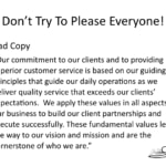
Paula Williams: Some reading here. [LAUGH] I know you hate this John, so don’t look. If you are listening to the podcast then you can’t see this on the slide. If you’re watching the video, I apologize for reading. But this is bad copy. Our commitment to our clients and to providing superior customer service is based on our guiding principles that guide our daily operations as we deliver quality service that exceeds our clients’ expectations.
[SOUND]
John Williams: Good grief.
Paula Williams: We apply these values in all aspects of our business to build our client partnerships and execute successfully. [SOUND] These fundamental values lead the way to our vision and mission and our cornerstone, the cornerstone of who we are.
John Williams: So what did that really say?
Paula Williams: Can you even guess what kind of company this is?
John Williams: No, I mean reading it I’m thinking, [INAUDIBLE]
Paula Williams: Could be an FBO?
John Williams: Could be consulting. [LAUGH]
Paula Williams: Could be consulting, could be maintenance, could be insurance, could be anything, right.
John Williams: So what was it? What happened?
Paula Williams: I’m not going to tell you. [LAUGH]
John Williams: [LAUGH]
Paula Williams: Actually it was a form of legal services in the aviation industry. So if this was your website, I deeply apologize for making fun of you. But seriously, those are long sentences that say almost nothing in a big block of text that really does not give anybody an idea of who you serve, what results you provide, what problems you solve.
Any of that is not really clear.
Be Clear About What Problems You Solve, and For Whom
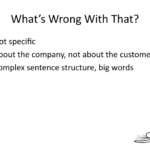
John Williams: Yeah, and it’s about the company, not about their clients or customers, so.
Paula Williams: Exactly, so yeah, what was wrong with that?
John Williams: I did one of them. I just said, it’s about the company not about the customer.
Paula Williams: One is that it is not specific, it could apply to any company.
There’s a thing we did in one of the workshops, one of the marketing workshops that we go to, and that is what we call the logo test. If you take a website and you swap out the logos and any identifying name, obviously, and you can’t tell which company it’s for then that website fails the logo test.
John Williams: No joke.
Paula Williams: Okay, and so the company that used that copy pretty obviously fails that test because that could be about any company. Much less any of their competitors or anything like that. It doesn’t describe anything unique about them or any reason you should do business with them, right.
Number two is it was about the company, not about the customer. So when I’m visiting a website, I want to know that this is somebody that gets what I’m looking for. So I want that to be all about me [LAUGH] being the customer, right.
John Williams: Absolutely.
Complex Sentences & Big Words Don’t Work Online. Even Smart People Don’t Like to Work That Hard.
Paula Williams: Okay, the third thing that was wrong with it was very complex sentence structure and big words.
John Williams: Yeah, and I’m not entirely sure I agree on some of the grammar I saw in that anyway.
Paula Williams: Okay, yeah. I think the grammar was all technically correct, I didn’t see any glaring-
John Williams: Nothing glaring but you have to be, unfortunately have heavy English like I had growing up.
Paula Williams: Yeah, so when people are reading, especially on the Internet, they don’t want to work that hard. So you might say, well my customers are really smart. Okay, that’s great, but they don’t really want to work that hard while they’re reading their coffee and doing, drinking their coffee [LAUGH] and reading your website and doing a million other things.
John Williams: No, it needs to come easy to them.
Paula Williams: Exactly.
Scannable Content Has Subheadings
John Williams: So you can glance down, hit this and if you knew how to read fast you want to still be able to read fast.
Paula Williams: Mm-hm.
John Williams: And with that kinda thing it’ll slow you way down, and make you tired.
Paula Williams: Exactly, so you really want to shoot for about an eighth grade level or below for anything that’s written on the web and it’s not because our customers are eighth grade level. It’s because we don’t want to make them work that hard.
John Williams: Exactly.
Paula Williams: And there’s some resources on the web where you can evaluate your copy, and look at what grade level is this.
And if it’s too high, then you really want to do something.
John Williams: You can also do some research to validate what you just said about grade level.
Paula Williams: Mm-hm.
John Williams: It’s not just us standing back. It’s pretty much across the board. If you don’t do it that way, you lose people.
Paula Williams: Absolutely. So a lot of the research on sales is basically the simpler language you use, the more successful you will be in sales. Even if you’re selling to college graduates, post doctorates, I mean whatever it is that you’re selling to, their education doesn’t really matter, the level of language that you use does.
John Williams: Yes.
Good Copy Identifies the Ideal Customer (Or Helps Them See Themselves!)
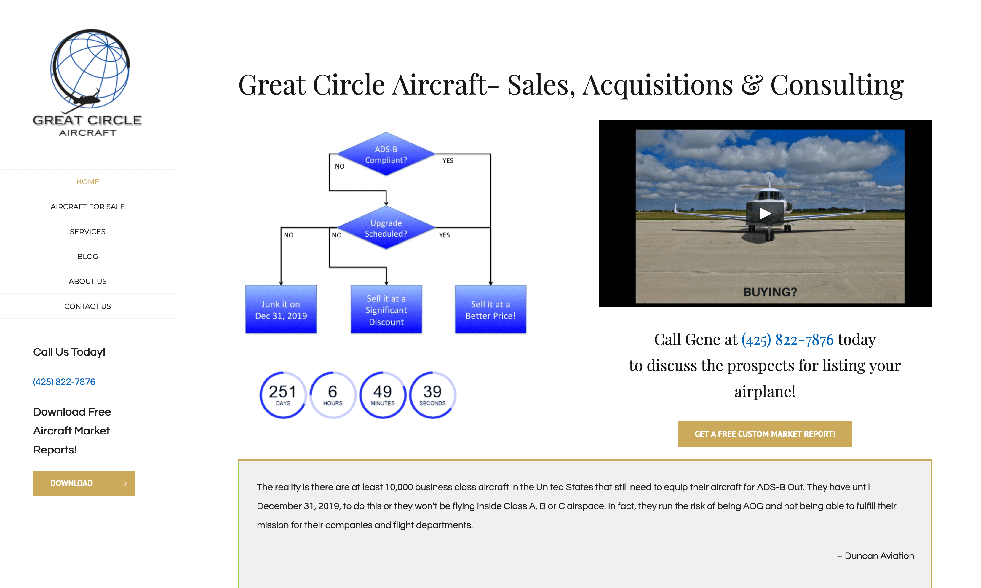
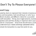
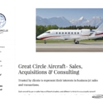
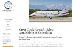 Paula Williams: Okay, cool, so let’s look at some good copy. And once again I am going to read, so I apologize to those of you who are watching the video. Trusted by clients to represent their interests in business jet sales and transactions. Each aircraft buyer or seller has a different situation, and different criteria for a successful aircraft transaction.
Timing, tax or legal concerns, business objectives and cash flow all play an important role in your needs for a transaction. Great Circle Aircraft listens carefully to understand your needs and brings substantial skill to conclude the transaction in a way that works for you. So.
John Williams: Each sentence tells you something about what you’re trying to get out of this.
Paula Williams: Right, exactly.
John Williams: And makes you want to read the next one, and see what’s going on.
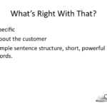
Paula Williams: Exactly. So obviously this is somebody that buys and sells business jets for people. He was very specific about the type of clients he’s looking for. It was about the customer.
The customer’s concerns are taxes and cash flow.
John Williams: Mm-hm.
Short, Simple, Concise, Powerful
Paula Williams: And timing, and those kinds of things. The sentence structure was simple, the words were short, and powerful. They actually said something [LAUGH].
John Williams: Right.
Paula Williams: So, right. That’s basically a block of text that’s good versus a block of text that’s bad.
So most Folks when they’re focusing on website design. They don’t really think about the copy, and they also don’t really think about the form follows function but copy, we think is the first thing.
John Williams: Actually, I used the words good and bad. I would say effective and ineffective.
Paula Williams: Okay, effective and ineffective, that’s fair.
John Williams: [LAUGH]
Paula Williams: But if we’re using small words, good [LAUGH] means effective.
John Williams: Yeah, yeah, yeah.
Paula Williams: And bad means ineffective. Okay, cool. So let’s talk about design.
John Williams: Okay.
Paula Williams: Okay, so if you’re seeing the video, you are seeing, this is actually a website that I pulled out and I don’t mean to embarrass anybody I just wanted to show what happens when you try to please too many people.
John Williams: And nothing on this is clickable, so we’re good.
Don’t Let Your Web Site Grow by Accretion
Paula Williams: Yeah, and do too many things. So basically, what this is doing. And this can happen for two reasons. One, it can happen by accretion. So if you’ve had the same website for a long time and you just kind of keep adding tabs, and keep adding functions, and keep adding sidebars, and keep adding links, then you end up with something that looks like this.
John Williams: And on top of that, Google was after you form, because [LAUGH] you’re not keeping your site cleaned up.
Paula Williams: Yeah, exactly. So that’s thing number one. And thing number two is it can happen when your site is kind of designed by a committee. And you say, okay, each department gets equal hearing here.
Your website should be about the function that we talked about, is it about regeneration in which case your sales department runs the website and all of your other departments get to take the back seat [LAUGH].
John Williams: And if you have multiple major practices, then have multiple major practice websites.
Paula Williams: Exactly, and your homepage should be a very simple clean front door. And you can always have microsites or other landing pages for very specific purposes. So there is nothing wrong with having five different websites for your company if you’ve got five different sets of customers.
John Williams: Of course.
Paula Williams: Yeah, or five different departments that do different functions and those can all be connected together.
Your Web Site Structure Shouldn’t Be the Same As Your Company’s Org Chart.
There’s nothing wrong with that but a home page as kind of a clearing house of information is a very 1990’s kind of an idea. It doesn’t work very well anymore, okay?
John Williams: Yup.
Paula Williams: Make sense? Okay.
John Williams: To me.
Paula Williams: Okay, so.
John Williams: We’ll find out if it makes sense to them [LAUGH].
Paula Williams: Call that bad.
John Williams: [LAUGH] When they review it.
Paula Williams: Right, [LAUGH] I’m sure we’re going to get comments. So this is what we call bad site design or ineffective site design to use your term.
John Williams: Okay fine.
Paula Williams: Okay. Now, this is what we’re going to call good site design, or effective site design.
John Williams: Good, good.
A Good Design Is A Simple Design – It’s Not the Mona Lisa
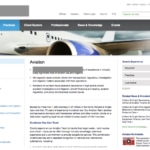
Paula Williams: Okay? So it serves one function. You’ve still got some navigation and things like that, but it’s also, I wanted to talk about the images on that.
When you looked at the other website there was an image, it was kind of a little header that was the side of a business jet that was very generic. In this one, there’s a couple of things that the image does. Number one, it’s a very specific business jet.
This happens to be a 604 that Gene sold recently. So it tells a story. It also has the mountains in the background, so it tells people where he’s at. He’s actually in Seattle, Washington. So you can see the Olympic Mountains in the background. It’s clearly not terribly generic stock photography and we have a problem in the aviation industry with aviation website design, because everybody’s using the same stock sources.
Getty images, and iStock photos, and Dreamstime.
John Williams: And that’s because it’s so danged expensive to go out, and get somebody to really do a good picture of an aircraft.
Paula Williams: Exactly.
John Williams: Even on the ground.
Paula Williams: That’s true. So then photography aviation photography is notoriously difficult because airplanes are so big and shiny, and cylindrical, and it’s just hard to get the lighting right, and everything else.
So if you have some good specific images those work 1,000 times better then stock photography but you gotta do what you gotta do. So if you’re on a budget or whatever, do what you can.
John Williams: Until you can afford to get your own image.
Aviation Website Design Tip – Use More Larger Images Than You Used in 2010.
Paula Williams: Exactly, and another thing is you want to use bigger images than you did five years ago.
Everybody’s using retina displays and nice big laptops, and nice big monitors with good resolution.
John Williams: Big meaning also high res.
Paula Williams: Exactly, yeah. You want to take up some space because people don’t mind scrolling and you also want to do them high resolution so that they show up nicely, and all of those things.
So those are all new from two or three years ago when everybody was using small images.
John Williams: Mm-hm.
Paula Williams: And being very compact, and like that other site that we were looking at, right?
John Williams: Yeah, and there’s reasons for that because the Internet’s faster now than it used to be, so.
Paula Williams: Yeah, especially for aviation consumers. You assume that they have broadband.
John Williams: Mm-hm.
Aviation Website Design Should Support The Site’s Purpose
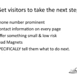
Paula Williams: Okay. Cool, so getting visitors to take the next step. There are things that you can do, very specific things that you can do to make that happen. Assuming you’re doing lead generation, I would say probably 90% of the people who are listening to this podcast, lead generation is probably the primary function of your website, right?
John Williams: Sure, you want to get more people in to make more customers.
Paula Williams: Exactly, okay, so you want to have your phone number very prominent. You should be able to see that within the first 15 seconds of landing on your website. Contact information on every page. The most common use of a website is to figure out how to contact you.
So that needs to be on every page in case somebody prints it and hands it to somebody else. That needs to be clear and obvious. You have to offer something small and low risk like a consultation or a lead magnet. Examples of lead magnets are things like tip sheets or checklists.
Other things that are really simple and easy for people to use that have the specific problem that your company solves.
John Williams: In exchange for contact information.
Paula Williams: In exchange for their contact information, exactly. And the last thing is you specifically want to tell them what to do next.
Fill out this form or give us a call or call to schedule an appointment. Be very specific about what you want them to do next in order to solve their problem, okay? So once again, no Random Acts of Marketing, that includes your website. Should not be a Random Act of Marketing, it shouldn’t just be we gotta have a website cuz everybody else does.
Let’s just throw some money at-
No “Random Acts of Marketing!”
John Williams: Or it shouldn’t contain a conglomeration of random acts of marketing.
Paula Williams: [LAUGH] Random acts of marketing. More than one random act of marketing doesn’t make it less random. In fact, you could argue it makes it more random, right?
John Williams: Exactly.
Paula Williams: Okay, cool.
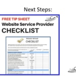
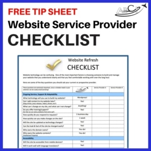 So you can download the website service provider checklist. We also have a website launch checklist. And we also have a lead magnet checklist. So, which ever of those three is the most important to you. Or all three of them. They’re all free. You can get those from our website.
Just go to Tip Sheets, which is a tab on the left side, and you can download whatever you need. If you need some work done on your website, we do free consultations. So you can just ask us to have a look at your website and see if it’s fulfilling its function.
And we’d be happy to do that for complimentary. It’s just a matter of finding a good time on our calendar. I know our calendar is kind of full this time of the month, right?
John Williams: Yes.
Paula Williams: But if you’re patient and persistent, you’ll find 30 minutes on our calendar that’s convenient for you.
Go ahead and schedule that, and we’d be happy to talk with you about your aviation website design. So what’s up with the insiders?
 John Williams: Well, so tell them about-
Paula Williams: [LAUGH]
John Williams: They can’t see, okay.
Paula Williams: No, they can’t see.
John Williams: Okay, fine.
Flight Level Furnishings
Paula Williams: Yeah, so Randy Woodcock is one of our insiders with Flight Level Furnishings.
He has this really cool desk. And if you can see this it’s really-
John Williams: He doesn’t have. He actually creates them. Speaking of great design – not aviation website design, but aviation furniture design.
Paula Williams: Creates them. He is creating aviation furniture. And if you ever loved things like MotoArt that use an engine cowling or whatever as a sectional sofa, those kinds of things.
This is really neat furniture.
John Williams: And a step above, actually.
Paula Williams: That is a lot more practical for the average office or home office or FBO because it’s custom.
John Williams: And it’s useful.
Paula Williams: And it’s useful. So he made this beautiful wing design or wing shape air foil desk.
And it’s got a glass top on it. And it’s an uplift desk. I had a standing desk. I’ve been using it for years. And I really think it makes a big difference in the way you feel at the end of the day, right? But this uplift desk is based on a wing design.
And he will size it, he’ll use the species of wood that you like for the wood parts of this. He will drill holes in the glass and make these fabulous polished grommets to put your cords through for your computer where you want it. Each piece is custom, but he’s doing a limited edition of 20 of the signature wing design desk, right?
John Williams: This is the high lift wing. And so, actually what you get are the, you see all the ribs, the spars, the trailing edges and it’s got a glass on top of that. And then you can adjust the height of the desk by the push of a button.
Paula Williams: Exactly.
John Williams: And electrically, because it goes up and down so quiet that you don’t realize it’s actually moving.
Paula Williams: Right, exactly. So, this is a, a lot of aviation furniture is kind of a novelty, but it’s not really something that you would use. And this is something that I would definitely use every day.
John Williams: Yeah, and he will actually put in slots in the glass for power cords or monitor cords, whatever it takes to whatever you like when you tell him what your specs are.
Francis Aviation
Paula Williams: Absolutely. Right, and then Francis Aviation, what’s up with them? They just hired a new pilot, Kevin Wickstrom.
Francis Aviation is actually down by the border in near El Paso, Texas. And they do charter services out of there. They also have FBO services in Las Cruces and-
John Williams: Santa Teresa.
Paula Williams: Santa Teresa. New Mexico. So down by the border. If you are doing business in that area, you know there’s a heck of a lot of road in Texas, right?
You can be on the road in Texas for two days [LAUGH] without getting into another state. So if you do business down there, by all means look them up. They do some really nice charter services in these luxurious new King Airs that have nice interiors and really cool stuff.
And Kevin Wickstrom has an interesting background. He was working with border patrol for a long time where he would fly any number of things in a given day of three different aircraft.
John Williams: Just depend on the mission. They go jump in a different airplane. I flew for the border patrol once.
Paula Williams: Did you really.
John Williams: I know how they work [LAUGH].
Paula Williams: Right, so fixed wing, rotor, jets whatever it is.
John Williams: Yeah, they actually have a really, from an aviation perspective, being a pilot for those guys has been very, very interesting.
Paula Williams: Right.
John Williams: And rewarding.
Paula Williams: Exactly.
And anyway, so Kevin came from the border patrol and is now working with Francis Aviation which is a great charter outfit out of that area. So look them up and have a great time traveling in that area as opposed to a really sweaty time in your car, right?
Great Circle Aircraft
Okay, Gene Clow, Great Circle Aircraft, just recently did a really nice summary of the-
John Williams: Market data.
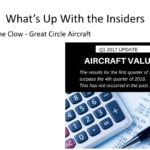
 Paula Williams: Market data for the end of the year. And found out that the first quarter of 2017 was better than the last quarter of 2016, which almost never happens, because everybody is buying and selling at the end of the year for tax reasons.
So he wrote a really good article on aviation website design that that is worth a read. That’s on Great Circle Aircraft. That’s one of the websites we talked about today, so give that a look. And that’s what up with the insiders. There’s always more than that, but we’ll mention a couple of highlights every week, right?
John Williams: Right.
Paula Williams: Okay, so go sell more stuff.
John Williams: America needs the business from our long lost friend Zig Ziglar.
Paula Williams: Exactly, so subscribe to our podcast on iTunes, Stitcher or Google Play. And please do leave us a rating. We’d really like for you to leave a review on iTunes because that’s how most people find us.
And if you leave us a good review then that let’s us get the word out to more people in aviation and gets a lot of the bad aviation website design, bad marketing and a lot of the waste and
Paula Williams: [LAUGH] Basically people spending a lot of money that they don’t have on marketing that isn’t effective.
And that’s bad for the whole industry, it’s bad for us, it’s bad for them. The better the industry does, the better we all do, right?
John Williams: Absolutely.
Paula Williams: Okay, all right, so have a great week and we’ll see you next time.
John Williams: Ciao.
Customers expect to find your company online, and expect your website to look up to date and professional. What was once a luxury for early adopters has become “table stakes” in a game you can’t afford not to play.
 Want to evaluate your own website and/or service provider?
Download our Website Service Provider Checklist
Aviation Website Refresh Service
Other articles about Aviation Web Design:
ABCI Responsive Web Design Process
Aviation Website Not Attracting Customers
The Best Aviation Websites for Marketing
How to Get Attention on the Web
Aviation Website Design – What Works?
Three Aviation Website Design Mistakes that Cost You Sales
Podcast: Play in new window | Download
Subscribe: Google Podcasts | Spotify | Amazon Music | RSS










[…] is on the first pages of a search engine results. Other clients can also be attracted to the Aviation websites if it has useful content and blogs. You can also directly advertise the website using pay-per-click […]
[…] Your aviation web development and marketing team should also offer ongoing website maintenance services so you can count on regularly updated aviation news content to continually bring customers back to your website again and again. Only by hiring a company with experienced aviation specialists will you be able to get the kind of expert content that you want for your Aviation web site. […]
[…] Aviation Website Design – What Works? […]
[…] have some very OLD articles on our website (and on the aviation websites of our clients) that get lots of traffic YEARS after they were published. These articles are called […]
[…] talk to people that design and market aviation websites. My mistake was I went to a local designer web designer here in the little town I live in and they did a great […]
[…] Aviation Website Design – What Works? […]
[…] are pretty exciting from an international marketing standpoint. And search engine optimization and aviation website translation which we’re kind of lumping together for this purpose because it’s about […]
[…] Williams: Exactly, okay, so of all of those people, a lot of people come to the website for other reasons, just to read an article or check a phone number or look at a stat or something […]
[…] Aviation Website Design – What Works? […]
[…] Aviation Website Design – What Works? […]
Great post! I really very like it, now i can make my own business website easily.
Thanks for sharing these information with us.
Thanks for your Awesome article.This post is very helpful for me. Please keep it up your writing.
can you tell me where I will get this kinds of informative post?
Very informative blog. Thanks for sharing this is very useful for me. Keep writing these types of blogs.
Your article is really infomative. I started web business various types like aviation website design, responsive design, etc. I’ll happy if we work together with you and me. if you agree pls reply to me.
Always happy to work with partners!
Very Nice!! Thanks for Sharing..
Very Useful Information, Thanks for Sharing with Us.
This is really great idea. Very Nice!! Thanks for Sharing..
Wow, finally i got this helpful article. it helpful so much for us to promotion our website.
Amazing blog! It is really very helpful to us. Thanks for sharing this with us.
nice post thank you for posting
Your article is a great resource. I appreciate you sharing. There are many new attractive website design and development technologies are entering the industry, resulting in new web design trends.
Your article is a great resource. There are many new attractive website design and development technologies are entering the industry, resulting in new web design trends.
Hi,
Really happy to say your post is very interesting to read. I never stop myself to say anything about it. We are one of the top IT solutions companies in Abu Dhabi, you can be confident with our IT services so that you can concentrate on your core activities. Check our page, “https://www.macouae.com/”. Expecting more blogs.
Great post! I really very like it, now I can make my own business website easily.
Thanks for sharing this information with us.
Great post! I really very like it, now i can make my own business website easily.
Thanks for sharing these information with us.