Advertisement Test Flight
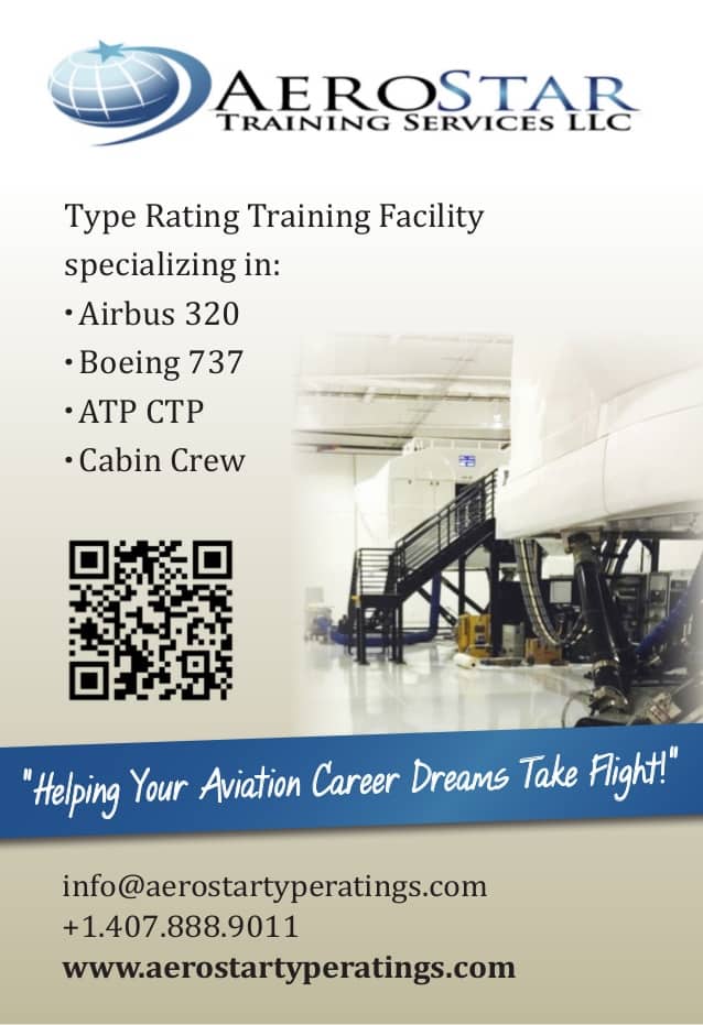
 Thanks to Bryan Pilcher and AeroStar for sharing their upcoming ad with us for the February Test Flight… Let’s take off!
Overall Rating – Piper Cub
This ad is a Piper Cub. What do I mean by that? I mean everybody loves to fly this, it’s tried and true, and it’s been around forever, but in the end if you need a plane for something specific, you’d probably be better off finding something more suitable to your needs.
Here are the details:

AeroStar is planning to publish this as a 1/4 page ad in Civil Air Training magazine as a brand builder and in preparation for the World Airline Training Symposium (WATS) in Orlando, Florida (sounds rough!).
Goods:
This ad looks great. It’s visually appealing, simple, and to the point… exactly what you’re looking for in a magazine ad.
I like it when companies use QR codes. They’ve been around for a couple years now, but they seem to give that cutting edge impression, and that’s what I want from an aviation training company!
Bads:
I don’t like it when the goal of an ad is “branding“. That’s very vague, very hard to accomplish, and impossible to track or gauge. Companies like Apple, Coke, and Boeing invest money in branding. They spend tens of millions on ad campaigns, and are constantly fighting for market share. I don’t think it’s the best option for you. Additionally, I looked at the latest Civil Air Training magazine and found 3 other flight training companies taking out full page ads and focusing on branding. This means you’re playing their game, but spending less on your ad, so you risk looking like a tier 2, when the goal of your ad is the exact opposite.
See this article on Brand Advertising vs. Direct Response
Of course, even if the primary goal is direct response, branding is important. Since you’re spending hard-earned money on this ad, you want to make sure the visual “branding elements” (like your logo ) are perfect and instantly recognizable. A little distortion between the printed ad and the logo might make people wonder, even for a second – “is this the same company?” You want there to be absolutely no doubt in people’s minds, so it’s a good idea to keep those image files in precise proportion. (You can scale them large or small, but never “stretch” them out of proportion with the original images or fonts from your logo.)
You don’t have a call to action. You have 4 different ways to contact your company on this ad (QR code which leads to your website, the web address itself, email, and phone number) but you’re not giving me specific instructions or a reason to do so. That makes this a really good looking business card. It has your business, a super brief description of what your business does, and then contact information. This will make somebody’s life easier if they already intend to contact your company, but it won’t persuade them to do so unless they’re already inclined.
We need to change that.
Suggestions:
Good news! There are 2 simple ways that I think you can knock it out of the park with this ad.
Since this ad will be smaller than the competition, it needs to be smarter, and have a more specific and compelling offer.
1). Focus on your Unique Selling Proposition (USP). You are in a very specific niche and you know exactly who will read this magazine, so use that to your advantage! Find the one thing that they need that you do better than everybody else. I know there are lots of things that AeroStar does better than the rest, but pick one and capitalize on that. Make it clear what you are “the best” or “the only” or “the most effective” at. The USP section of the Building Credibility & Closing webinar might be helpful, or here are some possibilities:
Having trouble keeping up with your training requirements? Call us at X to schedule recurrent training for your aircrew in the next 10 days.
Or
Is recurrent training a constant headache? AeroStar has your solution.
These ideas are geared toward training departments, and your company might have a different USP which you can capitalize on, but hopefully this got your creative juices flowing.
2). Use this ad as step 1 of your sales funnel. You are hoping to get people to think about your company when they see this ad. Well, that’s probably not going to happen if they just see a 1/4 page ad in a magazine. So what you really want to do is make them come see you when they attend the WATS conference. This will really give you a chance to show them all the amazing products that AeroStar has to offer. Put a little teaser ad in the magazine promising a handout (people love free stuff to an embarrassing extreme!) when they mention the ad to you at the conference.
You also need to include your booth number so that people know how to find you!
Make sure that whatever you hand out at the conference is something visible that they will wear or show off as they’re walking around. This will have the double benefit of increasing interaction and helping you gauge the effectiveness of your ad.
If you want this to be effective as a “lead capture” mechanism beyond the conference, you might use a web-based “call to action” (CTA) so that people are taken directly to the first step in your sales process.
- Download our Catalog!
- Get our eBook – Five Tough Questions You Should Ask Before You Begin Advanced Flight Training!
- Come by our Booth or Call for a Free Consultation!
- Complete an application!
Bonus – if you have a very specific “call to action” in your ad, (and direct them to a specific URL using the QR code or text) then you’ll know EXACTLY how effective this ad was, simply by counting the people who followed your instructions.
Alright. Your ad had 27 words in it, and I just took 1,000 words to talk about it. Why? Because I love this stuff. And because I’m pilot so I assume people want to hear what I’m thinking.
Long story short, if you publish your ad as is it will be a completely acceptable ad which will keep your name in the game, as a premier training company. But it won’t distinguish itself against the larger competition.
Additionally, if you’re able and willing to modify this ad to serve a specific purpose and aim it directly at your target audience, then you will have the double benefit of increasing interaction with that target audience while getting direct feedback as to the effectiveness of the ad.
Do you have an ad that needs a Test Flight?
If you’re a member of our Master Class then we can do it for free for our March Test Flight! Just submit your ad to me through our Facebook group, and you’ll get feedback and ideas from some of the best in the business.
-Jeff Stodola
Angels 6 Aviation
Trivia:
The WATS conference jogged a vague memory about the etymology of the word “symposium”. So I looked it up. It’s a combination of two Greek words from the 16th century meaning “to drink together”. Yet another reason the WATS conference in Orlando sounds enviable as we are enduring a cold winter! So stay warm out there, and just remember to be a little bit skeptical when somebody tells you how much they “worked” at the latest symposium.
Do you Dare to let Jeff take your ad for a Test Flight?

Our real-live fighter pilot, Jeff Stodola, is also a wicked sharpshooter when it comes to finding what’s wrong with your headlines, copy, and overall effectiveness of your ad.
He uses a 19-point checklist to give it a thorough once-over, and then gives you great (blunt) report with Goods, Bads, and Suggestions.
So, how do you line up for a Test Flight?
- Be a member of our Master Class!
- Submit your ad to paula@abci.flywheelstaging.com with the subject line “Test Flight” or through our Facebook Group.
- If Jeff chooses to take your ad for a spin, we’ll contact you!
