Three of the biggest aviation website design mistakes are the ones that lose the most sales. This is a surprise to sales and marketing professionals that worked and slaved and invested in these websites!
These are also the easiest to problems to fix! We talk about three of them in this episode.
[smart_track_player url=”http://traffic.libsyn.com/aviationmarketing/AMHF_128_-_Website_Design_Audio.mp3″ background=”default” social_linkedin=”true” ]

In our consulting work, one of the first things people want to talk about is their website. Aviation company CEOs, marketing directors, sales directors and founders want to talk about this.
“How does my website look? Is my website design costing me sales?”
On one hand, it makes a lot of sense to focus on the website first.
The website is one of the most powerful tools and often the centerpiece of many marketing campaigns.
You might meet prospects at trade shows, attract them with an ad in a magazine, or send them a postcard. But however you made the first contact, their first stop in researching your company will be your website.
Aviation Website Design Mistake #1 – Phone Number not there, or Hard to Find!

This is akin to having a computer not work, calling tech support, and the first, most irritating question they can ask you is this: “Is it plugged in?”
*Cough” Nobody here would be crazy enough to waste the time of an IT person without first checking to make sure everything was properly plugged in.
*cough, cough!*
But it’s worth asking about, anyway.
Even companies that PREFER to have new prospects send an email, complete a form, or engage with a chat bot. But they often find that their customers will PREFER to do business with a competitor, who has a real person answer the phone!
A Computer Weekly article cites data from a BT Business report that indicates small and medium sized companies are losing millions every year due to missed calls. The report states that, in the UK alone, SMEs are losing £90,000,000 (roughly $135,000,000 at the time of publication) due to missed calls. The BT Business report goes on to say that the cost average cost of a single missed call is £1,200, or about $1800. The report also shows that 85% of callers who can’t reach company on the first try will not call back and that 75% will not leave a voicemail.
Corollaries to this aviation website design mistake:
-
Phone # is hard to find
-
Phone # is not clickable
-
Phone # leads to a voice mailbox (!)
-
VOICE MAILBOX IS FULL! (The worst! This says “I am far to busy to even take care of the customers I have, much less have any time for new ones!)
IT IS HARD to have a real person answer the phone during the business day, but it’s definitely worth it. And there are services that offer smart, friendly telephone service, such as Call Ruby.
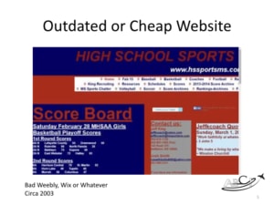
Aviation Website Design Mistake #2 – Outdated or Cheap Aviation Website Design

There are a TON of free or cheap website builders of varying quality.
There are a number of inexpensive website design services or freelancers who will offer to build a website for you.
These “inexpensive” options are often more costly than an aviation company can afford. You rely on your website to establish a first impression on a valuable prospect. This is an important job that can’t simply be outsourced to the cheapest bidder.
You wouldn’t hire a minimum-wage person to sit at your front desk and greet visitors to a high-end, high-trust establishment. And yet, that is exactly the purpose your website is serving.
Weebly, Wix, 1and1MyWebsite, and so on offer a way to set up a website quickly and without much of an investment or effort.
What’s wrong with this?
-
Your competitors are only a click away.
-
First impressions are made in seconds.
-
If you look like you’re investing less in your business than your customers’ other options, why should they choose you?
John calls this the “build a bear” method of building a website.
Aviation Website Design Mistake #3 – Poor Navigation

There are a TON of free or cheap website builders of varying quality.
There are a number of inexpensive website design services or freelancers who will offer to build a website for you.
These “inexpensive” options are often more costly than an aviation company can afford. You rely on your website to establish a first impression on a valuable prospect. This is an important job that can’t simply be outsourced to the cheapest bidder.
You wouldn’t hire a minimum-wage person to sit at your front desk and greet visitors to a high-end, high-trust establishment. And yet, that is exactly the purpose your website is serving.
Weebly, Wix, 1and1MyWebsite, and so on offer a way to set up a website quickly and without much of an investment or effort.
What’s wrong with this?
-
Your competitors are only a click away.
-
First impressions are made in seconds.
-
If you look like you’re investing less in your business than your customers’ other options, why should they choose you?
John calls this the “build a bear” method of building a website.
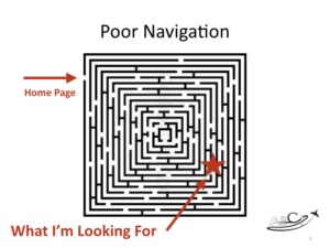
This mistake also has to do with a failure to put yourself in the shoes of your customers.
Some unscrupulous website designers will tell you to “bury” the most important details about your products or services,.
Their reasoning is that website visitors will stay on the site longer and visit more pages, because it takes longer to find what they’re looking for.
This gives visitors, (or search engines) far too little credit for intelligence.
If people don’t find what they’re looking for on your site, they will click away to use a competitor’s website that has a more intuitive and helpful design.
Frustration is NOT a great marketing strategy!
It’s fairly easy using Google Analytics to find out which pages are visited most often. Put yourself in the shoes of an ideal customers. What questions do they ask? (Or should they ask?) What is the sales process you want them to follow? How can you make it EASIER for them to begin to do business with you?
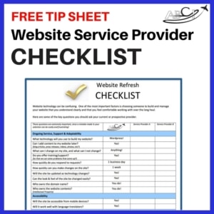
 Want to evaluate your own website and/or service provider?
Download our Website Service Provider Checklist
Aviation Website Refresh Service
Other articles about Aviation Web Design:
ABCI Responsive Web Design Process
Aviation Website Not Attracting Customers
How to Get Attention on the Web
Best Aviation Websites for Marketing
Aviation Website Design – What Works?


Just one more tip – Don’t use obscure software that doesn’t run on ALL browsers !
Like your slideshow – can not see it on Firefox, even with Ghostery and Disconnect
disabled … 🙁
…..Bobp
Yes, I know my website is a mess – it is a work in progress ! 😉
Hi Bob!
We’ve tested the slideshow in Firefox – it’s my primary browser, and it appears to work – is there an error that you’re receiving? I’d love to track this down! (As you say, it’s very important to avoid problems for ANY users!)
Another problem – broken links !
Download our Website Service Provider Checklist – says Oooops ! Page not available.
Tried several other pages – same problem …
Finally found it on the page under Free Tip Sheets — after turning off
Disconnect & Ghostery … they are ON because I HATE pop-up ads !
…And those little Google pop-ups on the bottom left are
SUPER annoying !!
………..Just MHO … 😉
….Bobp
Thanks Bob – we are always looking into our technology – we want to use what works, but also what doesn’t drive people crazy.
Thanks for the frank feedback.