Aviation web site case study – LD Aviation
Last week, we talked about the three things aviation web sites must do.
So, what does a FUNCTIONAL aviation services web site look like?
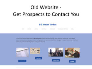
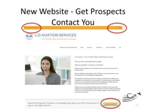
With the help of one of our very cool clients, we’ve created a case study with a “before and after” picture.
[smart_track_player url=”http://traffic.libsyn.com/aviationmarketing/AMHF_147_for_Podcast1.mp3″ background=”default” ]
 Airplanes have phase and time-delimited inspections, websites should too!
Web sites have many elements that can get out of date:
- Photos and facts become out-of-date
- Product and service information changes
- Company direction and focus changes
- Customer expectations change
- The browsers and devices customers use change
- The technology search engines use changes as well.
For all of these reasons, we recommend that every web site have a serious inspection and technology refresh every 3 years.
 In last week’s episode, we talked about the expectations of websites. It can get pretty complicated!
You may have customers and team members who want the website to do a number of things, and depending on your company, it might make sense to have your website make it easy for customers to “help themselves’ to more information, and take some of the sales and customer service tasks off of your team’s plate.
In many cases, that makes sense.
Our advice is that if you have information or services available on your website, to be sure they work smoothly and as expected.
It represents your company, after all!

Regardless or how simple or complicated your website might be, there are three things it should do well:
- Get found using specific keywords
- Educate prospective buyers
- Get prospects to contact you.
We worked with Lindsay Dyer of LD Aviation Services on their website, with these primary tasks in mind.
Getting a Web Site Found
In last week’s episode, we talked about how using the right keywords was as important as listing your company under the right category in the Yellow Pages. The good news is, you can “get listed” in as many categories as you have time, material and skill to optimize.
There are three factors involved in deciding which keywords to use: (From most to least important.)
- Relevance – keywords should be closely related to the product or service you offer, and should be the language that you and your customers use for those things.
- Popularity – how many people are actually searching for information on this particular keyword? (With the old Yellow Pages, we would never know unless we could, maybe see how worn-out specific sections of the Yellow Pages would be! But with on the Internet, we have some wonderful new tools that can provide this information.)
- Competition– how many other companies and websites are trying to get their materials found using those keywords? (We can discover this by searching for that keyword in Google – the most popular search engine- or by using software.)
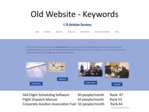
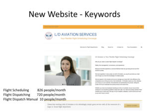
So, the keyword results we found on the old website were
- FAA Flight Dispatch Software – somewhat relevant, low popularity (with 30 searches per month)
- Flight Dispatch Manual – also somewhat relevant, low popularity (with 10 searches per month)
- Corporate Aviation Association Fuel – probably not terribly relevant, but slightly more popular (with 50 searches per month)
Competition didn’t weight much into our valuation, since we could do much better with the more important factors of Relevance and Popularity.
Educating Prospective Buyers
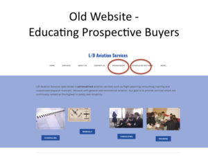
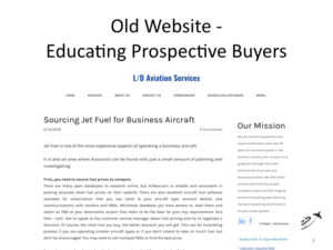
Lindsay’s original website had some great resources for educating buyers, including a fantastic blog with some very valuable and informative articles. Our only job here was to add a bit of context and fit them into the structure so that they were more easily found.

Get Prospects to Contact You
While many aviation companies depend on an active team of salespeople and trade shows to drum up business, the website should also play a role in the sales process, at least as far as providing convenient ways for prospects to get in touch with the company.
A few items we recommend:
- Contact information – phone number and email at the top of the page and visually prominent
- Clickable phone numbers and email addresses
- Complete contact information (including postal address) on every page, ideally in the footer
- Links to a complete “Contact Us” page, with multiple options, including the ability to schedule a call.
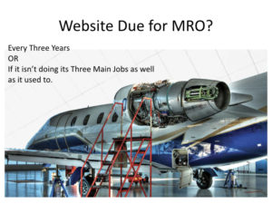 Is your aviation web site due for an MRO?
If it’s been more than three years, OR if your website isn’t doing a good job of its three primary responsibilities, let’s talk about what it would take to get it up to speed.
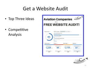
We also have a free utility on our website where you can get an automated audit that will show you how your website stacks up to others on the web.
You can schedule an appointment with us to discuss your website. Pick any convenient 30 minutes on our online calendar.
Podcast: Play in new window | Download
Subscribe: Google Podcasts | Spotify | Amazon Music | RSS





Leave A Comment