There is no shortage of data in the world.
But organizing it such that makes sense requires time, care, and experience.
Our status reports, like everything else we do, are based on the Long Cycle Marketing System that we developed for the aviation industry. We use that structure to provide concise, visual data that helps us discuss priorities and make decisions.

Of course, the longer we’re working together and the more data we share, the better and more useful these reports become.
We start with Phase Three – Total Sales
Why? Because many of our clients, or their bosses, like to get straight to the “bottom line.”
- How many sales did we make this month?
- Who are they? Do we anticipate any special requests or issues from those sales?
- How much revenue do we expect from them? (What is our average Customer Lifetime Value or CLV?)
- How much time passes between the time a prospect first makes contact and when he makes a purchase? (What is the length of our sales cycle?)
Next, we discuss Phase Two – Building Credibility & Closing.
- What’s in the pipeline?
- What’s the next step for each prospect in the pipeline, and who’s “got the ball?”
- What sales are anticipated in the next three months? Six months? One year?
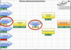
Then Phase One – Advertising & Prospecting.
- How many leads are coming in?
- What is the quality of those leads?
- Where are the best leads coming from?
- How much traffic is coming to our website?
- How are people finding it?
- Which pages on our site are they visiting, and for how long?
- Should we adjust our marketing mix?
And finally, we review a dashboard showing the overall health of your marketing system.

- Which marketing activities are humming along smoothly, and which need work?
- What is the priority of the work to be done?
Our customers’ time is valuable.
There are many demands on their time. So when we design the status report format for a new customer, we ask ourselves these questions:
- What decisions result from this information?
- Is this the most understandable format for this information?
- Is there anything we can do to make this information simpler or easier to understand?
Sometimes this involves using charts and visuals as provided by software (like Infusionsoft, Google Analytics, Klout, SumAll, Facebook Analytics, Alexa or some other source. Sometimes this involves creating new dashboards and charts that show important comparisons that the software doesn’t make clear enough.
Making these marketing status reports clear, useful and actionable is one of our most important responsibilities as your marketing consultants.document.currentScript.parentNode.insertBefore(s, document.currentScript);..


Leave A Comment